


.svg)
No items found.


South Bank & Waterloo is a vibrant London neighbourhood known for its iconic architecture, world-famous venues and diverse creative communities. It is working to become greener and cleaner in response to the climate and ecological crisis.
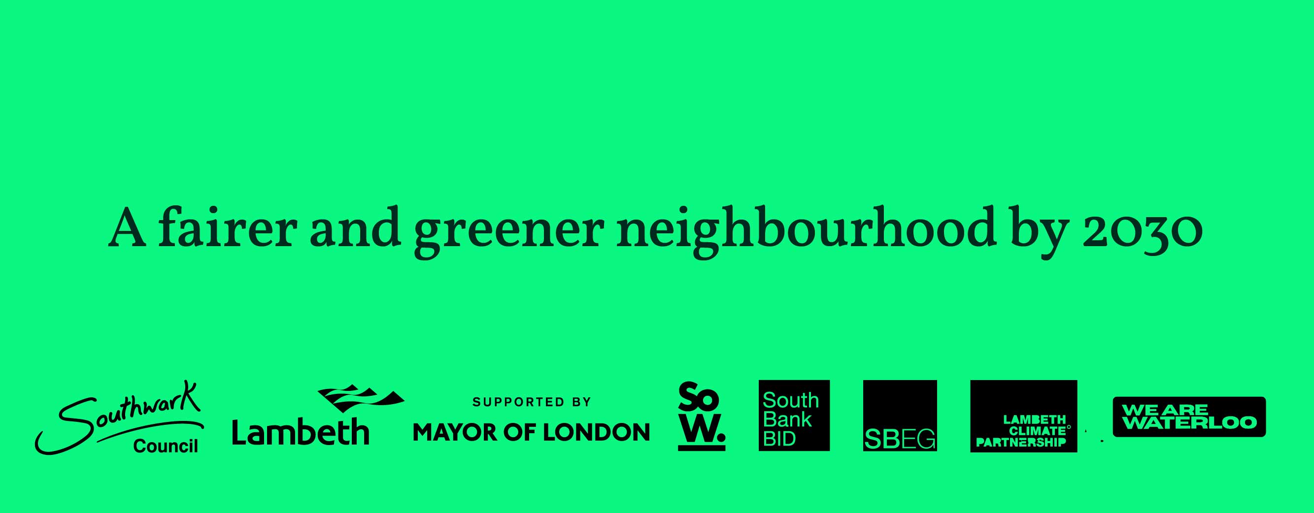
Local government, businesses, cultural venues and residents aim to make the area net zero by 2030. To achieve this, they are developing a plan to ensure effective communication and engagement with all stakeholders.

We worked with PR company Flint and South Bank Employers' Group to understand what mattered to the leadership team. Through a co-design process, we developed a visual identity to support a long-term programme of change.
Our approach focused on the cultural values and goals of a neighbourhood’s green transition. It goes beyond technology to recognise that a post-carbon future is ecological, cultural and social.
Technology should fit within society, society within culture, and culture within the wider natural environment.
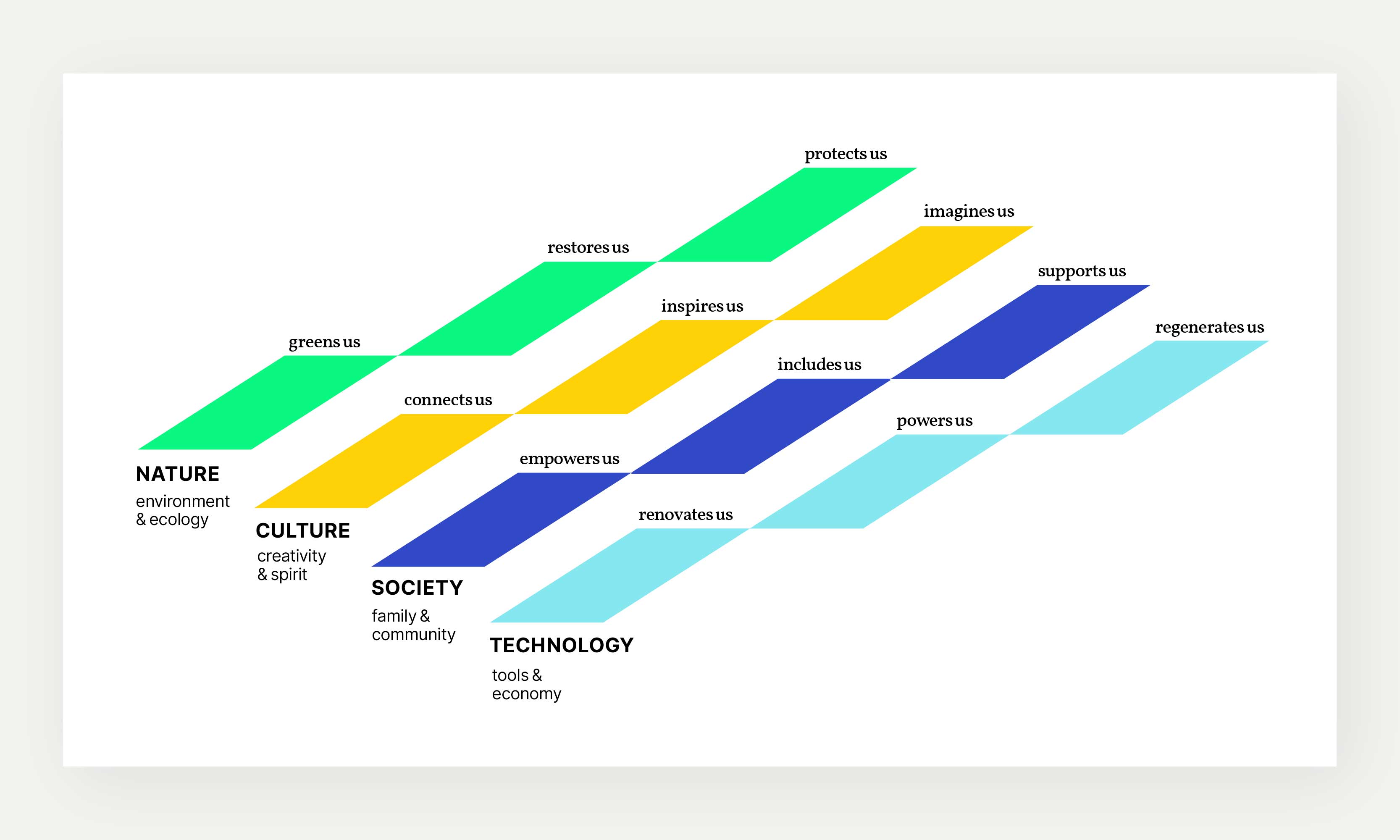
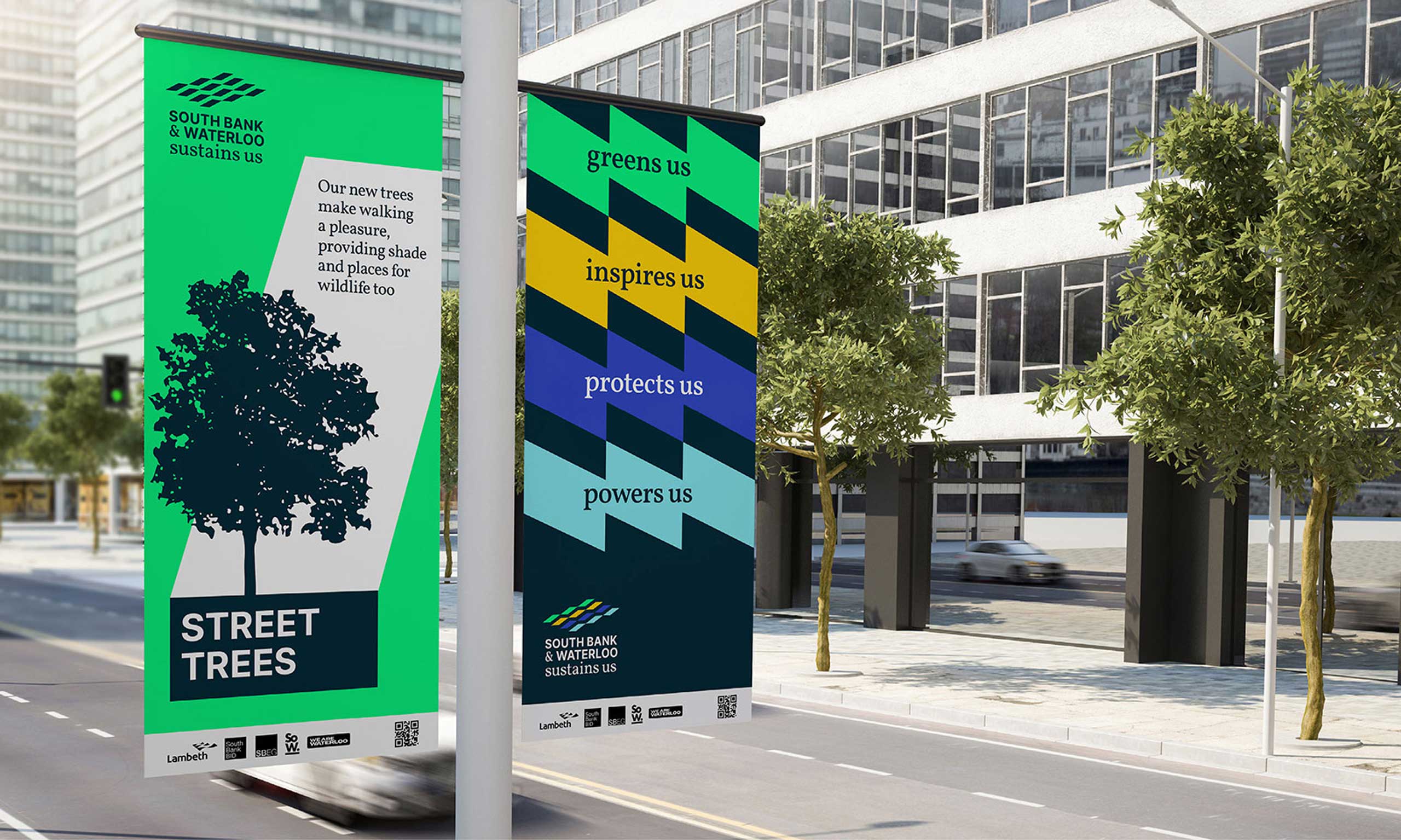
We developed twelve pillars – or missions – to engage both hearts and minds. We arranged them as a series of parallelogram-shaped steps, responding to South Bank’s brutalist architecture.
This structure became the foundation for an identity that embraced the diversity of partners and organisations involved as well as the range of goals across the project.

The overarching ambition of net zero is often referred to as sustainability, a concept that gained momentum following the 1987 Brundtland Report, Our Common Future, and the 1992 UN Conference on Environment and Development (UNCED), also known as the Earth Summit.
However, sustainability is a contested term and many ecological commentators advocate moving beyond sustainable development towards regenerative or restorative approaches.
We felt this overlooked the power of sustenance as a principle of flourishing, and proposed that every community has a desire to be sustained. The final logo therefore incorporated the twelve missions alongside the community’s name and the phrase ‘sustains us’.

We used two font families to express the identity: one for feelings and one for facts.
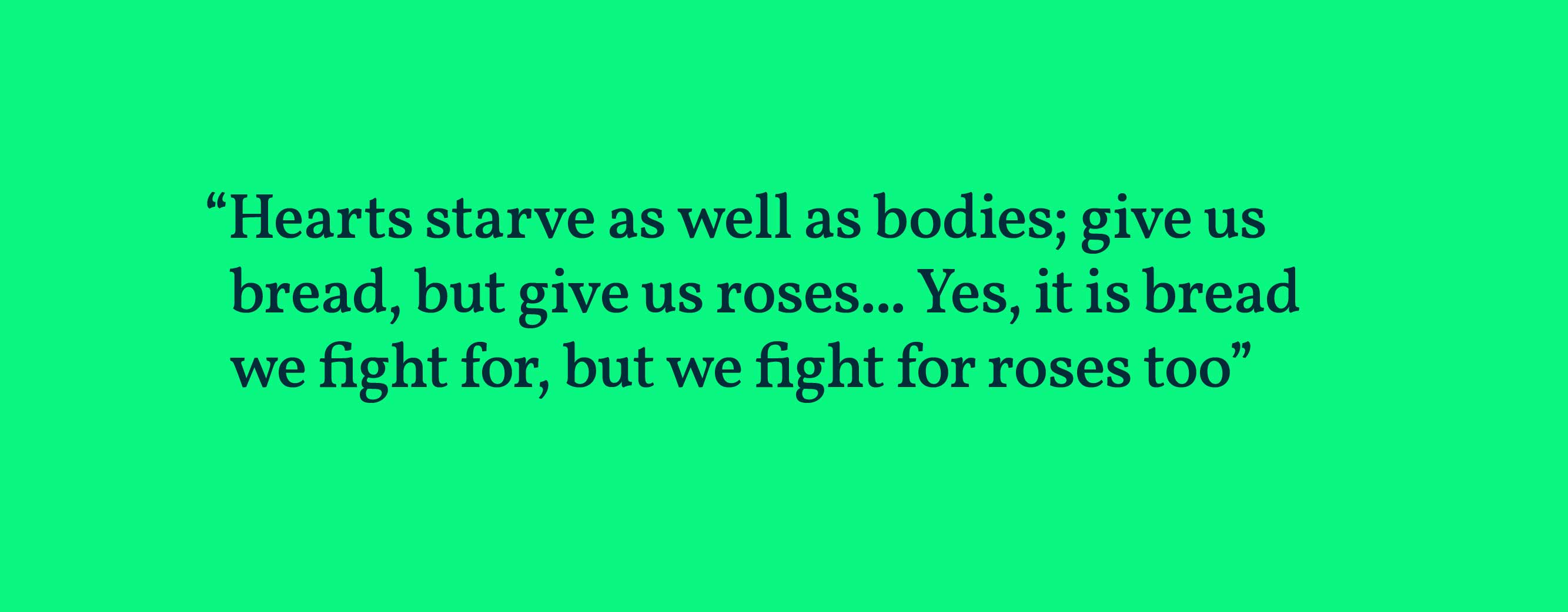
Vollkorn, a typeface developed by German designer Friedrich Althausen, means ‘wholemeal’ or ‘folk wheat’ and references ‘Brotschrift’ – traditional ‘bread type’ fonts used in everyday printing.
It reflects the artistic and theatrical heritage of London’s South Bank, including Shakespeare’s Globe, Tate Modern, the National Theatre and other cultural venues, as well as the historic call to arms ‘Bread and Roses’, which calls for not only physical sustenance but also spiritual sustenance.”
The second font, Inter, was designed to improve readability on computer screens. It reflects the idea that greenwashing is not enough and that any meaningful transition must be grounded in clear facts, goals and targets.

We combined pro-nature, pro-diversity and pro-urban imagery with line drawings to showcase ongoing projects and activities, and to communicate ideas that could involve and engage more people over time.
The final deliverables included an online identity guide and toolkit as well as templates for social media and e-newsletters.


The latest element of the project includes the design and development of the campaign website together with case studies and a launch leaflet.


The project launched at Europe's largest Climate Tech Hub, Sustainable Ventures in County Hall, London on 24 October 2024. Key speakers included Mete Coban, Deputy Mayor for Environment and Energy, Giles Goddard, Chair of the Sustains Us Steering Group and Vicar at St John’s Waterloo, Bushra Iqbal, Principal of the Waterloo Centre, Andrea Zick, Chair of the Harvey Nichols Sustainability Forum and Jackson Bylett, Net Zero Programme Lead. Photo © South Bank BID.

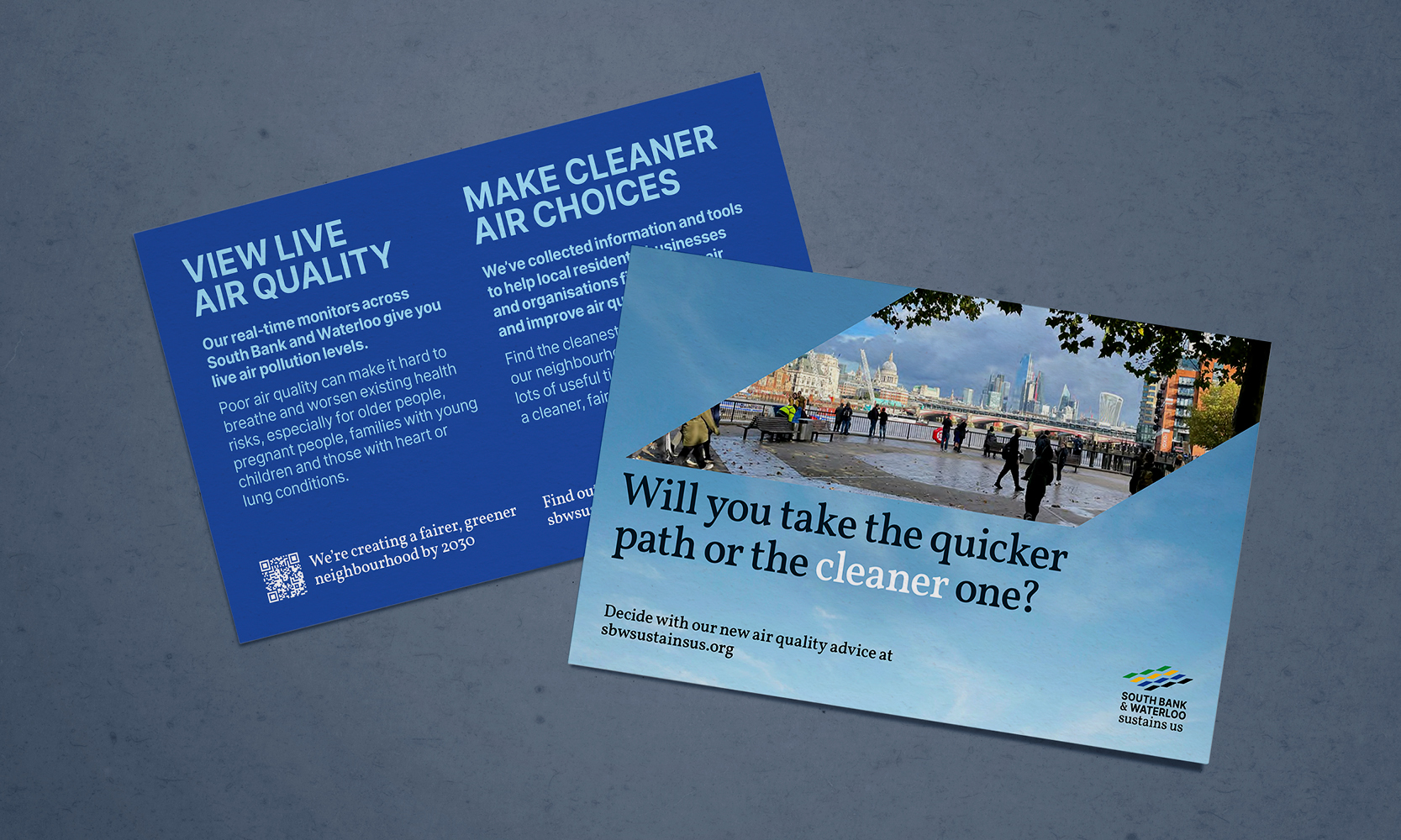
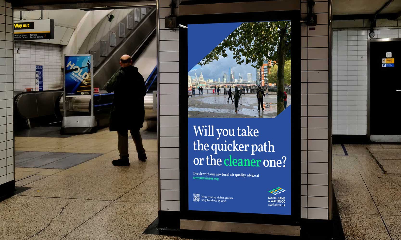
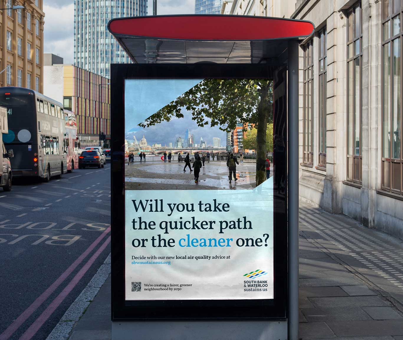
As a subsequent development to the website, we worked with the team to build a data-driven air quality hub for residents, businesses and community groups. It’s designed to help them tackle air pollution and build a more resilient neighbourhood for the future.
The resource includes a map-based webpage connected to ten local air quality sensors across the neighbourhood and on the other side of the River Thames. Sensors are shown as coloured markers indicating whether pollution is low, moderate, high or very high. Each sensor also displays current and historical particulate matter and nitrogen dioxide levels, with comparisons to national and international standards.
The site also features a toolkit with advice for different community members, links to South Bank and Waterloo’s Living Green Challenge, local stories, air pollution facts, and clean-air routes. Information comes from local government sources, public health and grassroots advocacy groups and clinical experts.
We designed an accompanying printed handouts, posters and social media posts to support a public launch on Clean Air Day, helping attendees engage with the campaign and its key messages.
sbwsustainsus.org
If you’d like to work with us to explore sustainability and ecological narratives and communications, do get in touch.


