.svg)
No items found.


We partnered with the Royal Society of Biology to reimagine their identity, enhancing their ability to communicate with students, members, professional biologists and the broader community.
“Thank you for turning the RSB brand into a thing of beauty. This looks very professional and engaging, delivering key messaging about RSB in an easily understandable and clear format.”

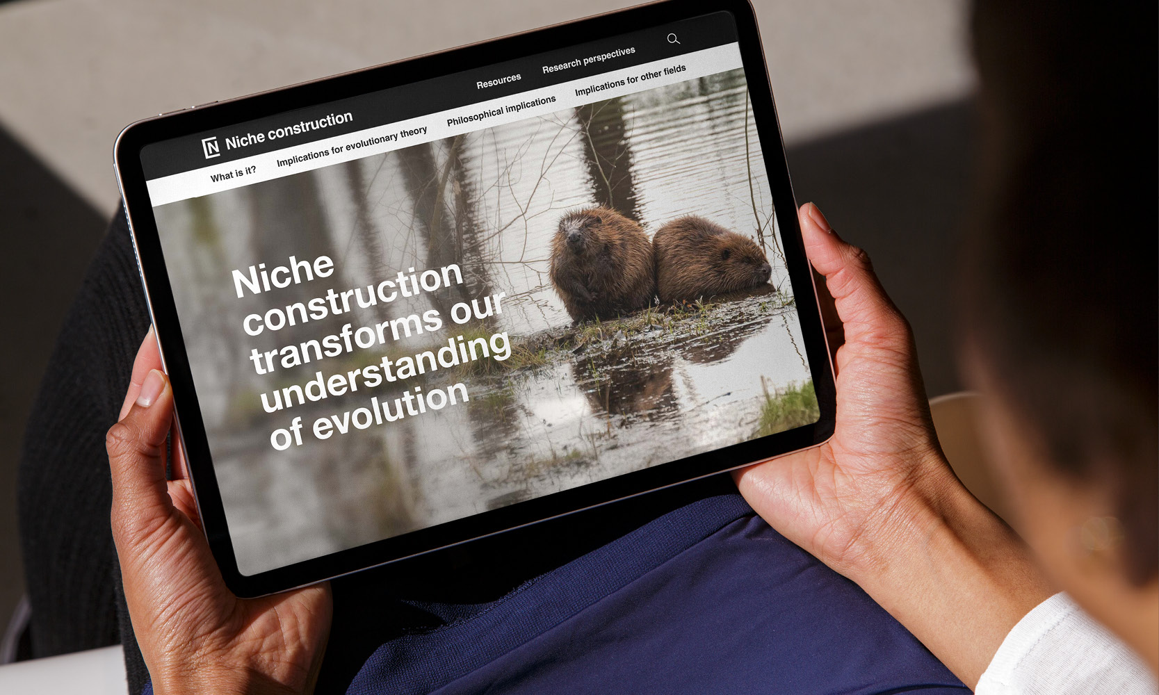
In our first meeting with the team, we suggested a new website structure that related to the concepts of discovery, development, decision making and society, using images of the natural world and new wording to emphasise life as being at the centre of biology.
We referenced Nature’s palette: a colour reference system from the natural world (1814), highlighting that the underlying colours of living things included greens, yellows, orange, red, brown, purple and violet. True blue colours or pigment are rare in nature and most plants and animals use light to appear blue.


A second key change was the suggestion that no single pictorial ‘mark’ could effectively represent biology's diversity; instead, we developed a new word mark that is complemented by a variety of natural images and colours to bring the richness of nature to life.

We used Noto typeface in sans and serif form to capture both the modern nature of biological research and the deep tradition that informs the life sciences.


We helped to develop a new strategy, multiple touchpoints, an icon set, social media assets and presentation templates together with design directions and templates for animations, sub identities and other contexts.


The imagery included examples across ‘Scales of life’, ‘Biologists at work’, ‘Cutouts from life’ and ‘Living collages’.
In parallel with the development of the identity, we undertook a review of the RSB’s website. This included a review of their audiences, goals and purpose, an analysis of the information architecture and consequently a new structure and visual design direction that builds on the overall identity.


We’ve applied the identity across various touchpoints, including social media and YouTube assets, stationery, posters, PowerPoint presentation templates, event collateral and award certificates.


We provided design guidelines for updating The Biologist magazine, ensuring a clear connection to the RSB. We also developed other sub brands including the RSB‘s Bioscience careers day and Biology week.


“Well done to all involved!”
The website components we developed for RSB’s Bootstrap framework have now been handed over to their developer. We anticipate fully implementing the design this year.
If you are interested in using design to engage with your audiences, transform your strategy and communications and engage with global challenges, please do get in touch.